

Alogomandra
A private wine label identity shaped through illustration, myth and a wide visual exploration of what the bottle could become.

Overview
Alogomandra is a private wine label with a strong sense of place. The name points to Aleomandra / Alogomandra in southwest Mykonos, where rough coast, sea light and the mythological reference to Apollo’s horses gave the project more than one possible visual route.
The final label uses illustration as its identity: horse-like forms, abstract shapes and Mediterranean colour create a bottle that feels expressive without losing structure. It is not a generic vineyard mark. It belongs to a name, a place and a private-label context.
Before the final choice, the work had to test how far the idea could move: photographic horses, minimal black-and-white systems, typographic labels, vintage wine cues, collage, pattern and colour-led illustration. The point was not to decorate the bottle. It was to find the version with the clearest character.
Skills: Wine Label Design · Label Route Exploration · Illustration · Packaging Artwork · Print Design · Typography · Private Label Identity · Mediterranean Visual Direction
Range
The selected bottle becomes stronger when the alternatives are visible. These routes show the same name tested through restraint, photography, illustration, nostalgia, graphic contrast and wine-label convention.
That range matters in private-label work. A small object has to make one clear decision, but the decision is better when it has been tested against real alternatives.
Twelve label proposals
One broad exploration, shown across two boards, to cover a wide field before the final bottle had to choose one clear voice.
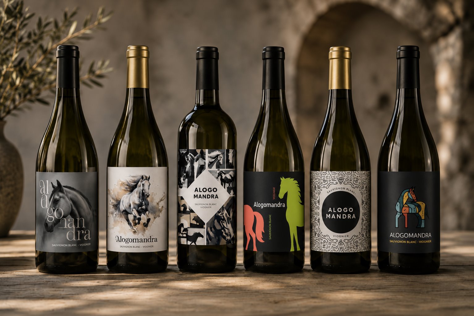
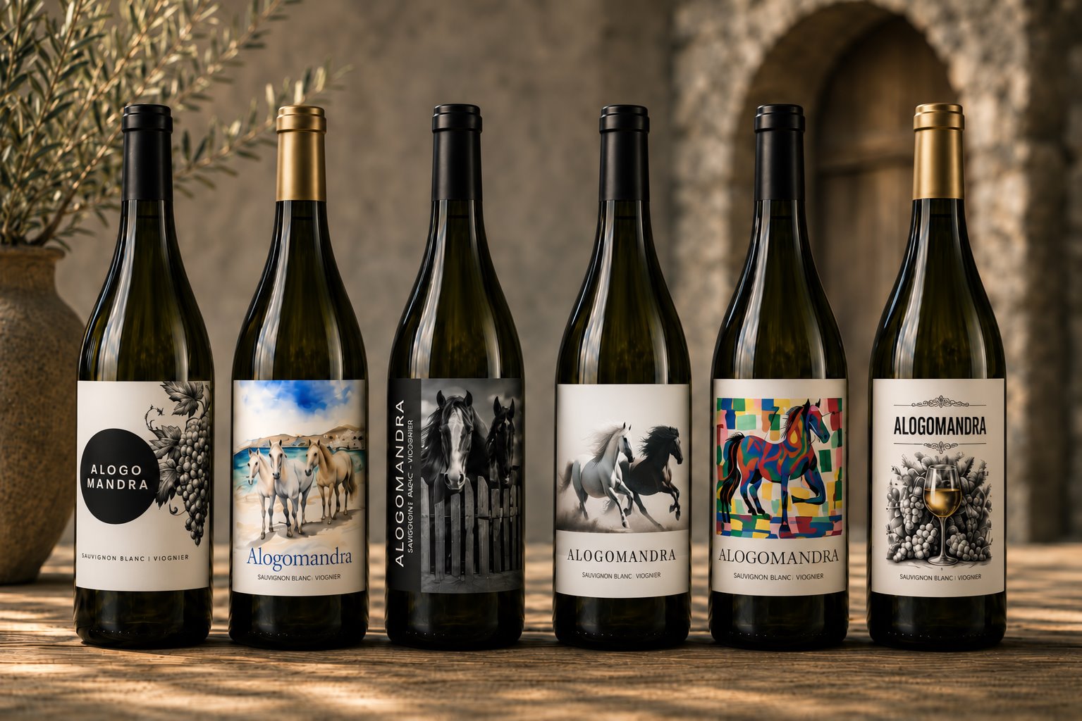
The final label matters because it was selected, not assumed. The chosen route kept the horse reference, the Mykonian place and the wine information in one controlled composition: energetic enough to be remembered, structured enough to print and sit on a bottle.