

Sushi Experience
A weekly Japanese menu shared by two restaurants with distinct visual identities, laid out as a bento box so that each one keeps its own.

Overview
I designed the menu for Sushi Experience: every Thursday from 17:00, two restaurants with completely different personalities serve one Japanese menu together.
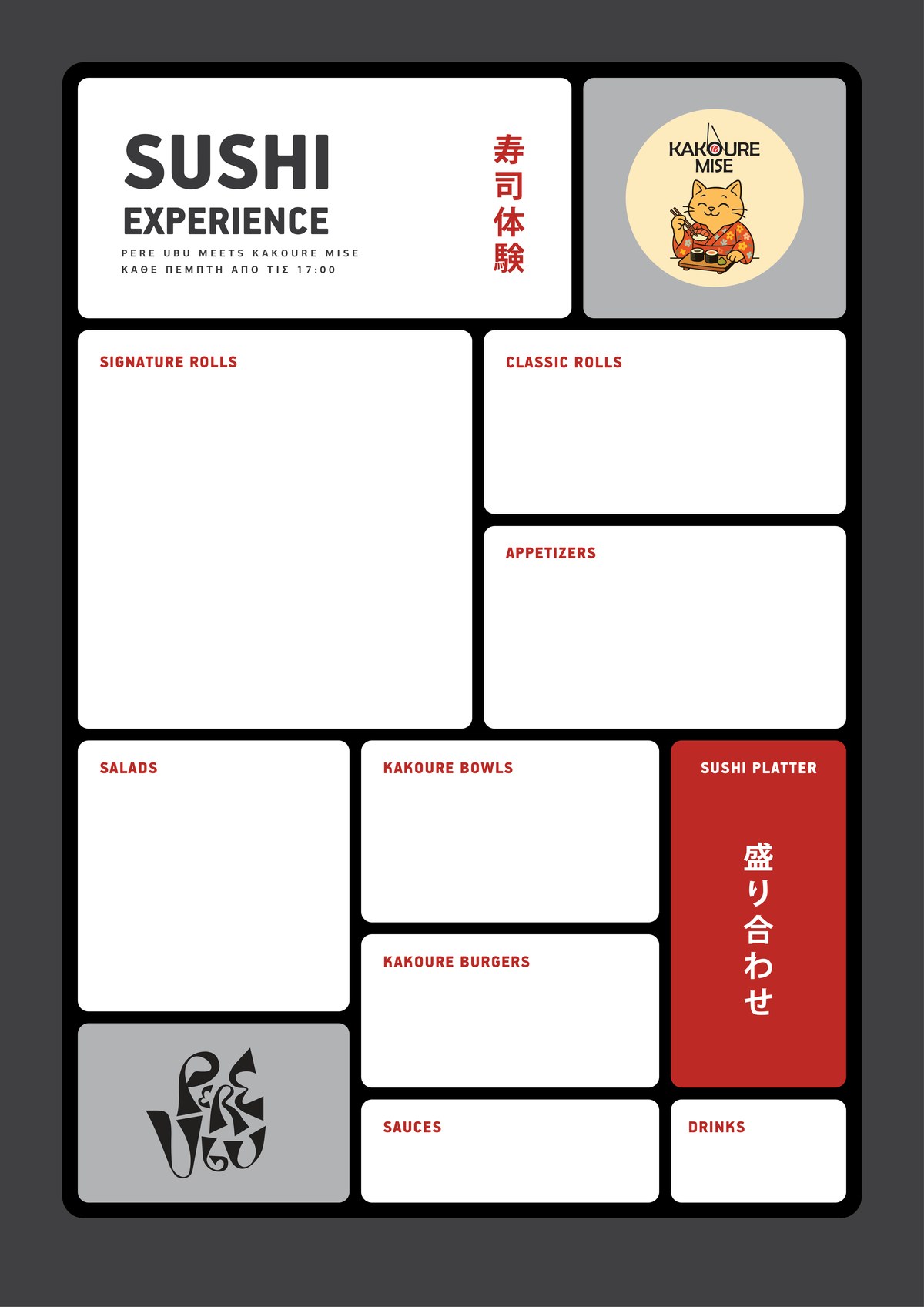
One logo is a black calligraphic monogram. The other is a cat in a flowered kimono, eating sushi inside a cream circle. Putting either one in the other’s colours would have erased it, and a blend of the two would have belonged to neither.
The dishes came from the client and the two logos came with the brands. The rest of the page is mine. On this page a € stands in for every price.
Skills: Menu Design · Grid Layout · Co‑Branding · Typography · Print Production
A bento box
A bento keeps every dish in its own compartment, and the box holds the meal together. The menu works the same way: a black frame and twelve compartments, nine white ones for the food, a red one for the platter and two grey ones for the logos.
Nothing crosses a divider. Each category starts and ends inside its own box, so the eye can go from the rolls to the salads without reading what lies in between.
Two logos, two corners
Each logo has a grey compartment of its own, the same grey for both, and neither was recoloured or redrawn. The cat sits at the top right, beside the title, because the food is theirs. The monogram sits in the opposite corner, bottom left, so the two logos balance on the diagonal.
The box itself takes no side. Its frame is black and its compartments white. The one colour I added is a red, and it marks only the headings, the Japanese and the platter.

Japanese, twice
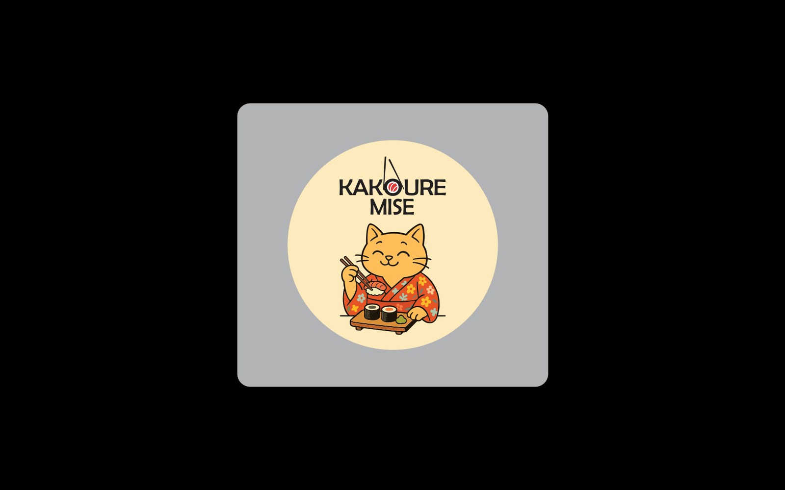
Two phrases, set vertically, the traditional direction for Japanese. 寿司体験, sushi experience, runs beside the title. 盛り合わせ, moriawase, the word for an assorted platter, runs down the red compartment of the 28‑piece platter.
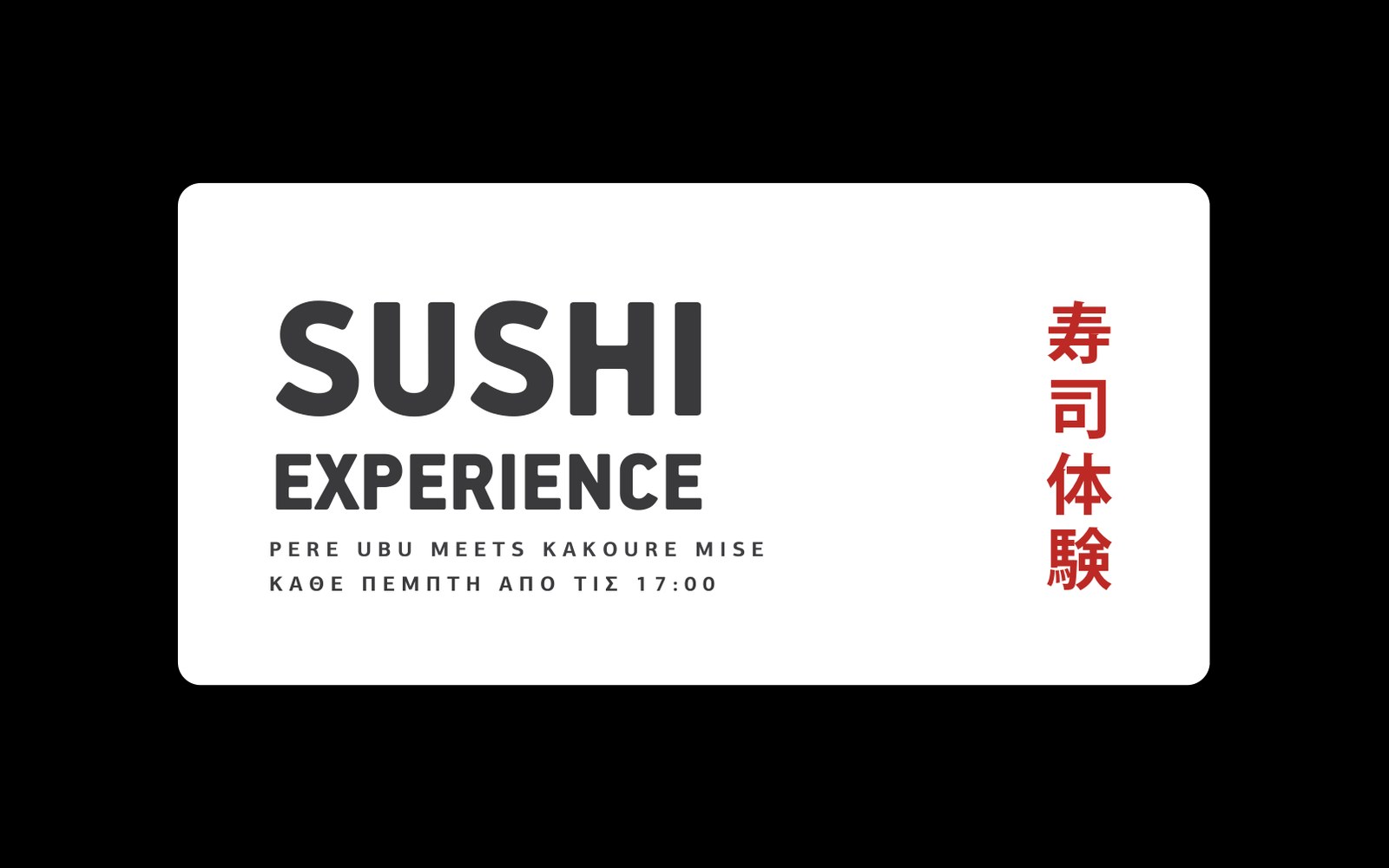
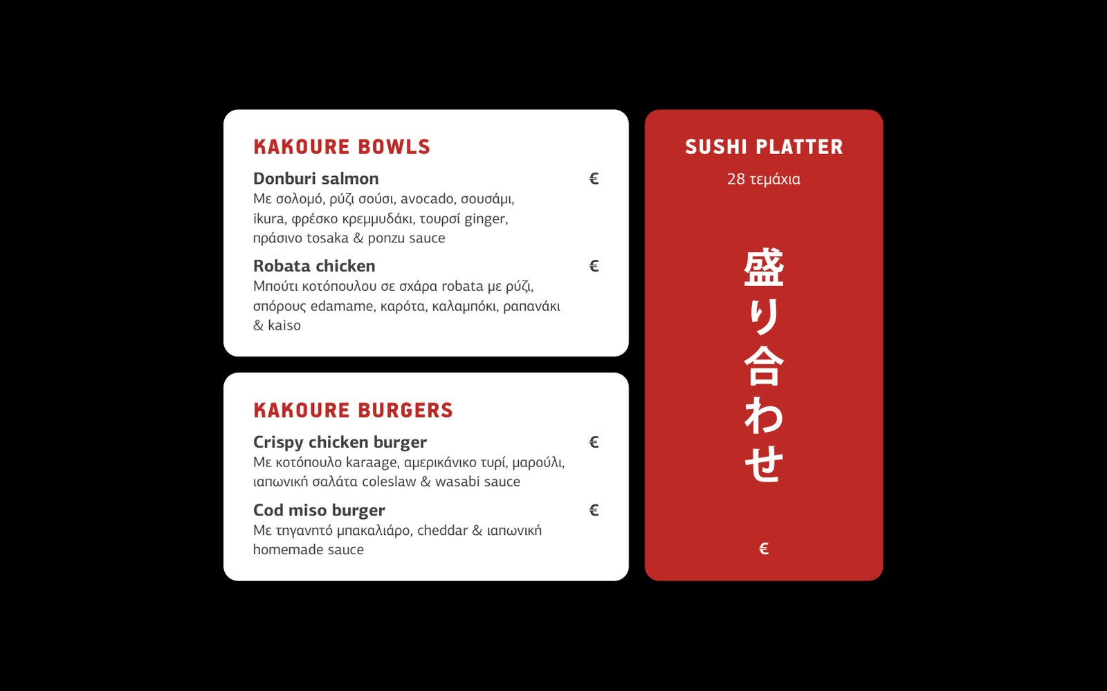
A box, not a blend. Each logo keeps its own compartment and remains unchanged. The black frame brings both into one menu.