Kea Mare
Seven logotype routes and one lasting mark for luxury villas in Kea.
Overview
Kea Mare needed a visual language before it needed a logo: a quiet identity for a small collection of luxury villas on Kea, close to Athens, but far from the louder codes of the Cyclades.
Kea is not Mykonos, and its villas should not dress like it. The first round deliberately explored the language of Greek hospitality: script, sun, wave, olive tree, geometry. The question was not which symbol looked pleasant. It was which direction could belong to Kea Mare once it touched stone, fabric, paper and guest-facing details.
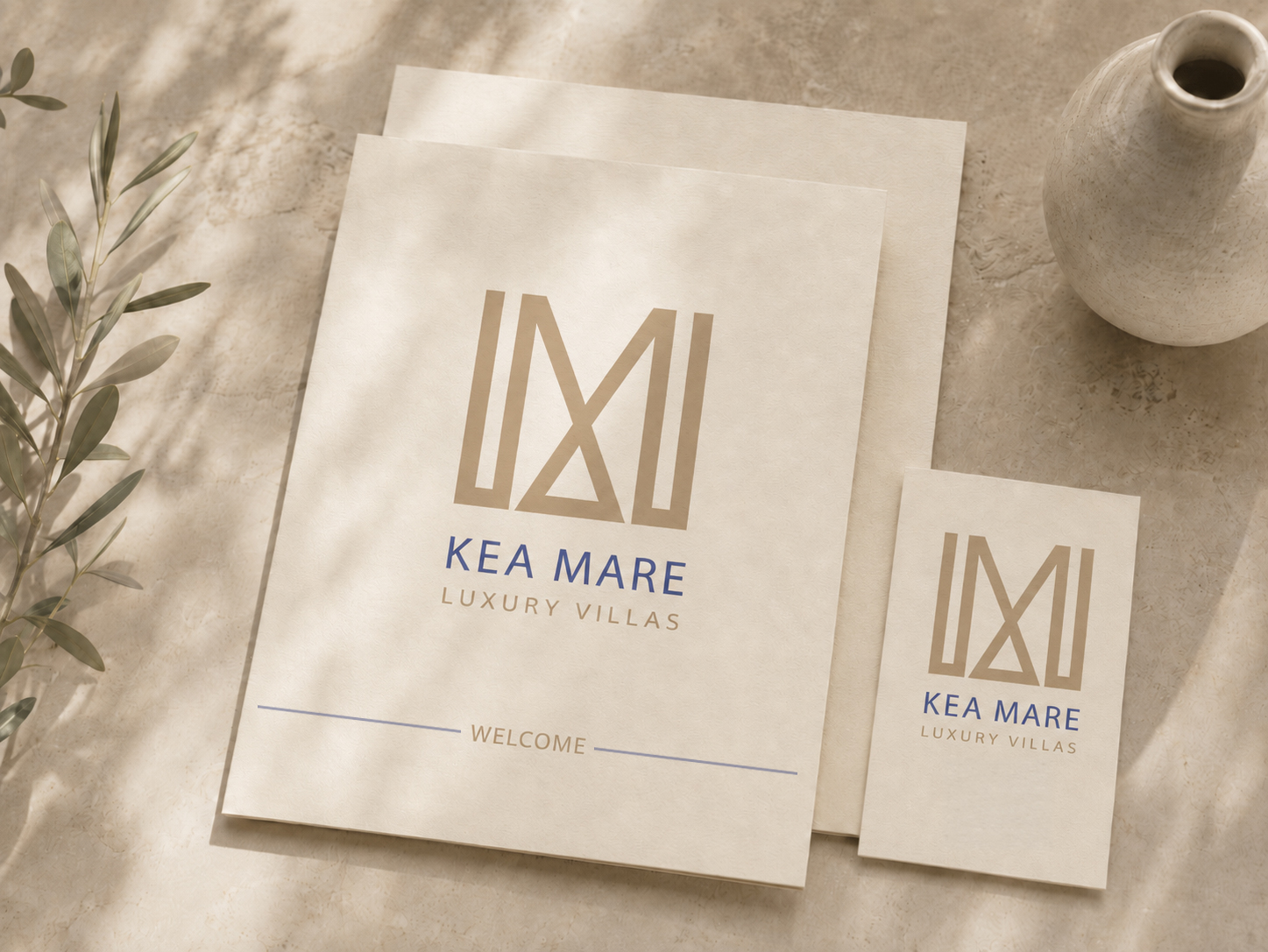
The identity had to move from mark to system: stone signage, embroidery, cards, stationery and the small touchpoints that make a stay feel considered.
Skills: Hospitality Identity · Logotype System · Visual Research · Typography · Geometric Composition · Signage & Physical Touchpoints · Brand Application
System
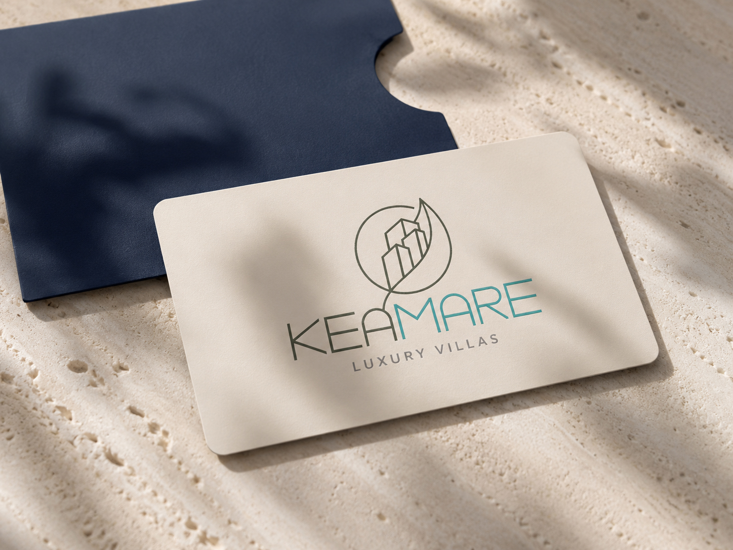
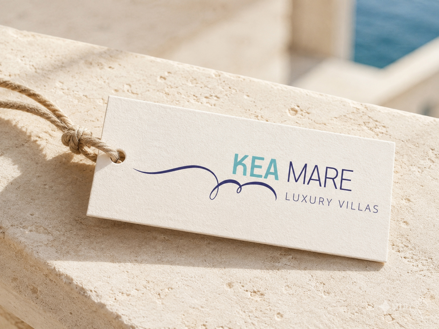
The final route was the geometric monogram: two mirrored forms closing into a triangle, set over widely tracked capitals. My instinct leaned warmer, but this mark had the strongest system logic. It could move cleanly from welcome stationery to stone signage, textile, paper and small-format guest touchpoints.
The other proposals follow as evidence of the range. Script, sun, wave, olive tree, architectural line, calligraphic movement. Each route tested a different way the brand could behave before one system had to hold the physical applications together.
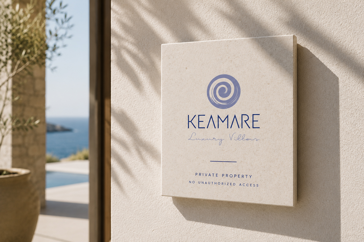
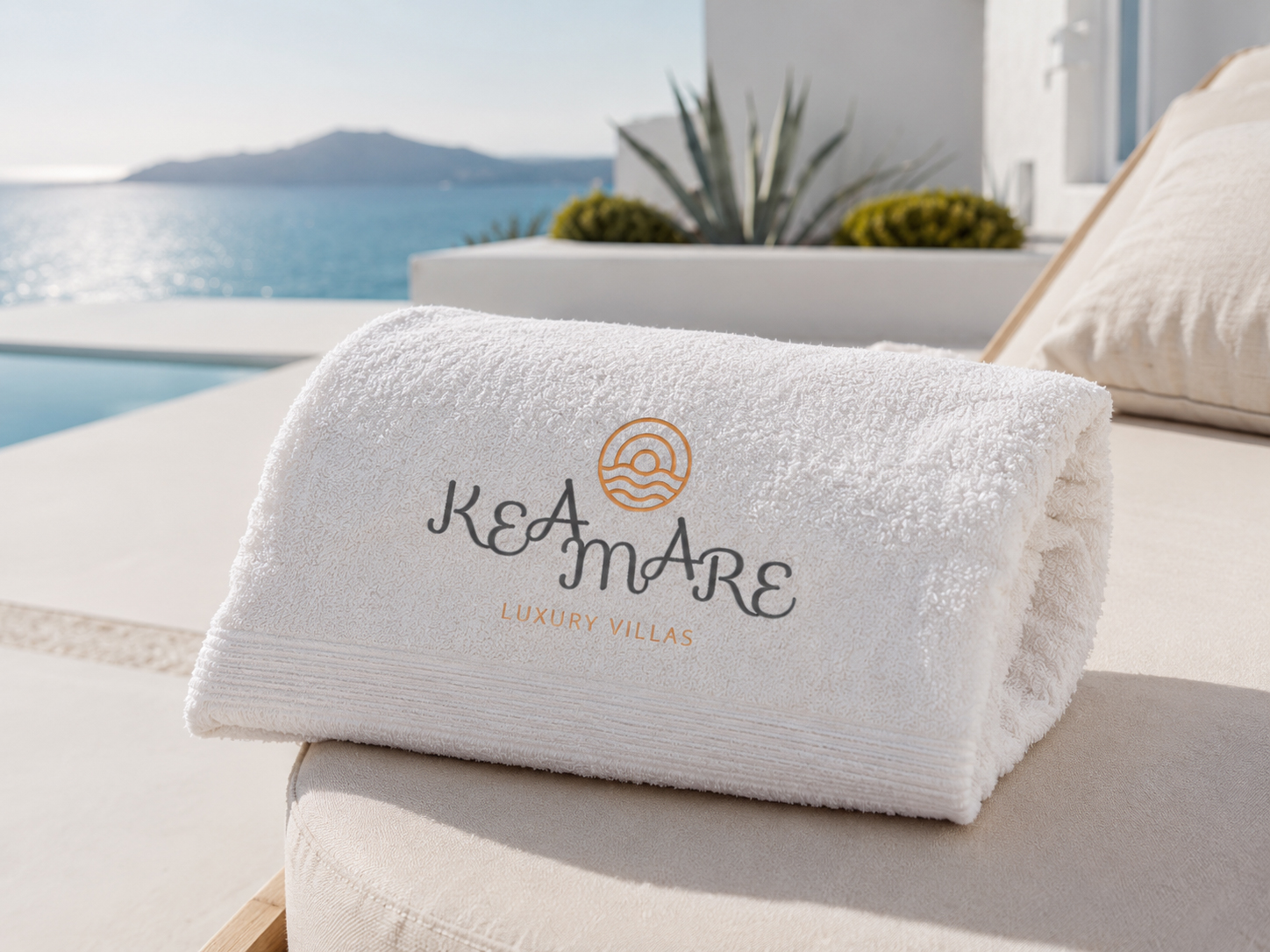
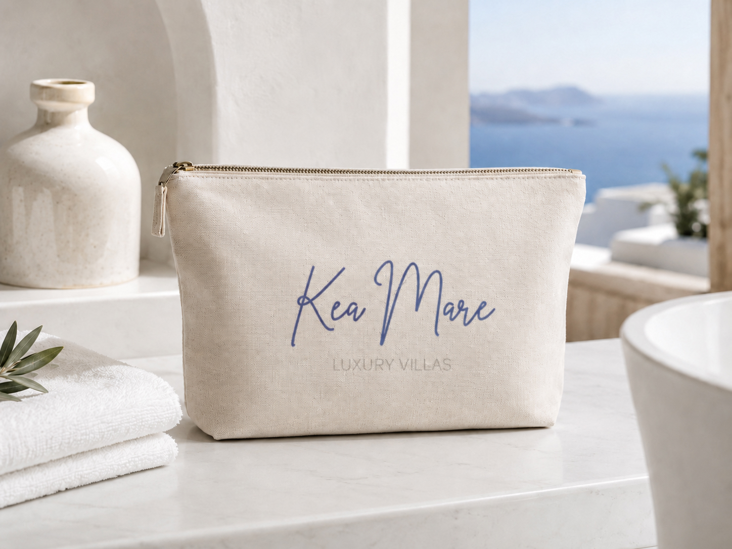
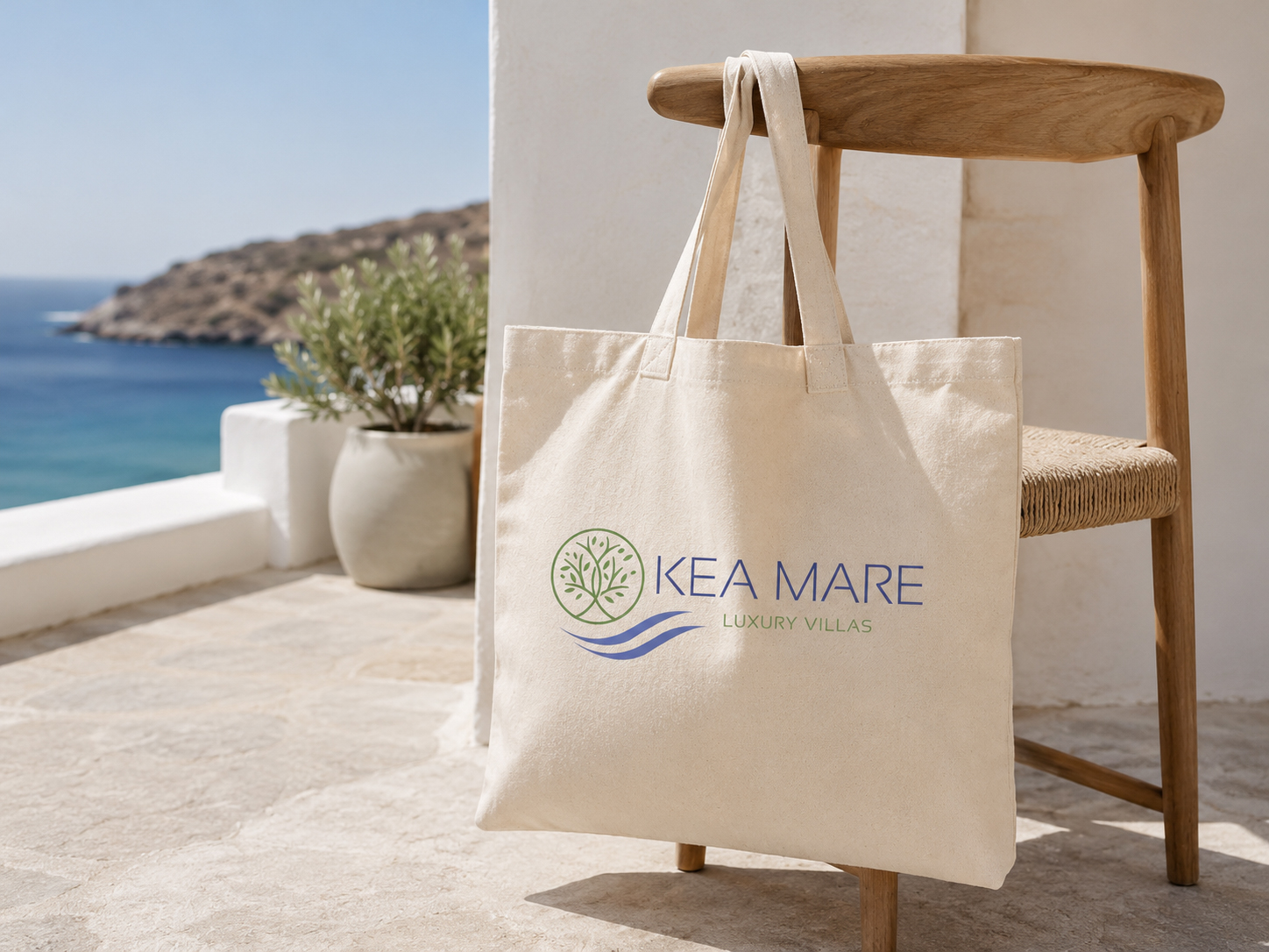
A hospitality identity is not judged on a presentation screen. It is judged on a wall, in the sun, on a towel, on paper and in the small touchpoints a guest actually meets. Kea Mare shows the method: explore the full emotional range, put seven defensible proposals on the table, then carry the final identity into the places where the brand actually lives.