

Piu Verde
A long-running menu, table and physical touchpoint system for an all-day restaurant inside an urban grove.

Overview
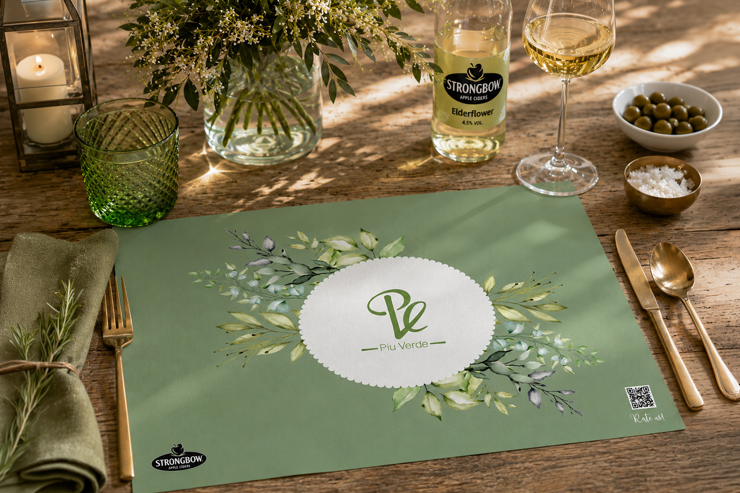
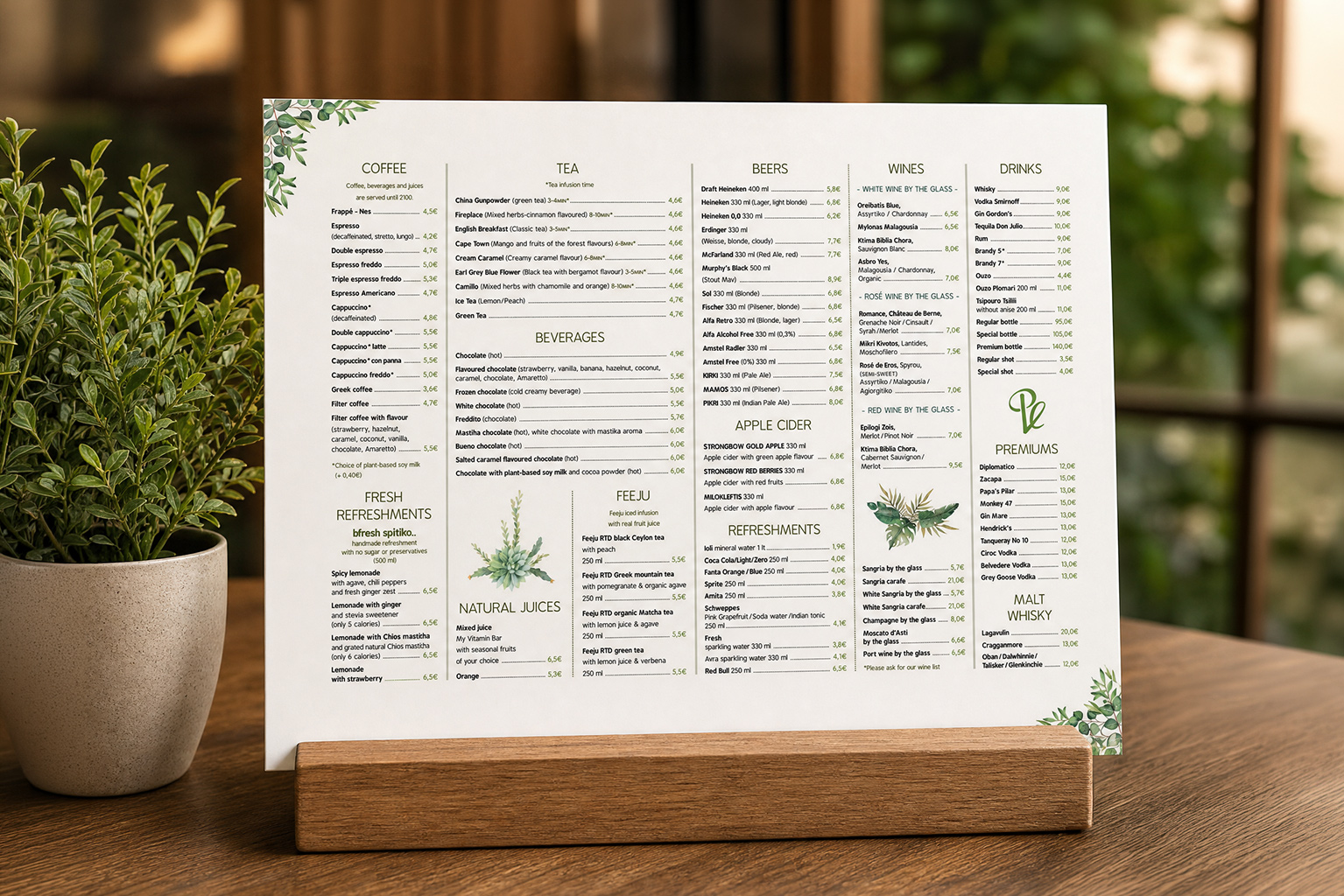
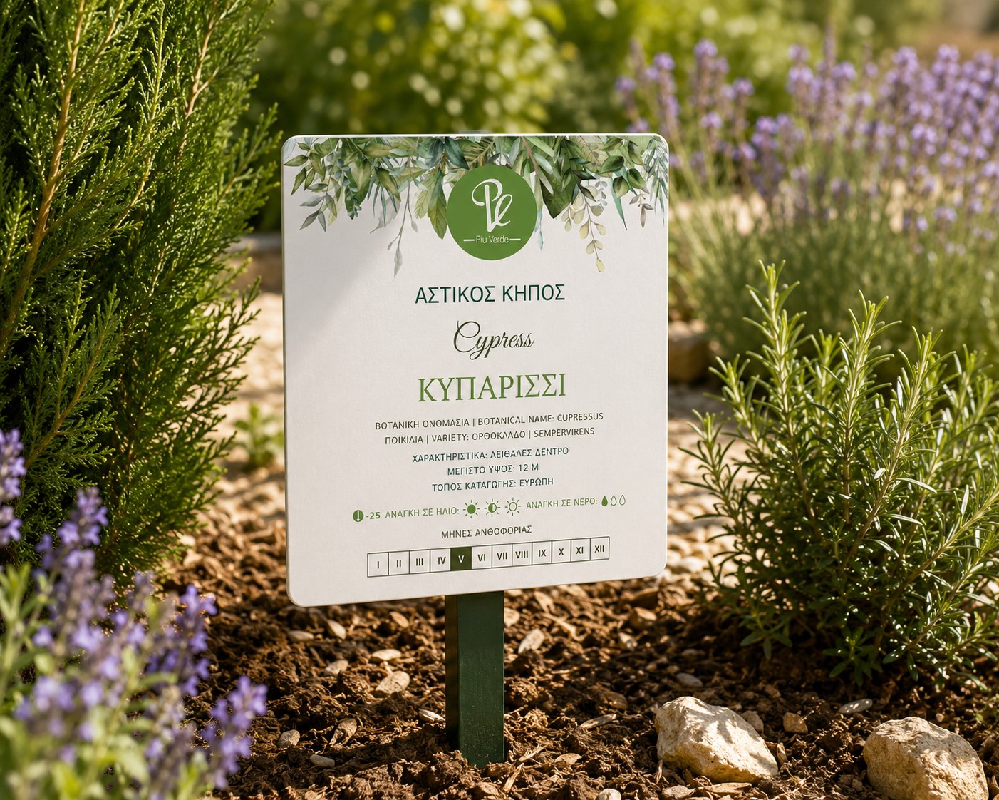
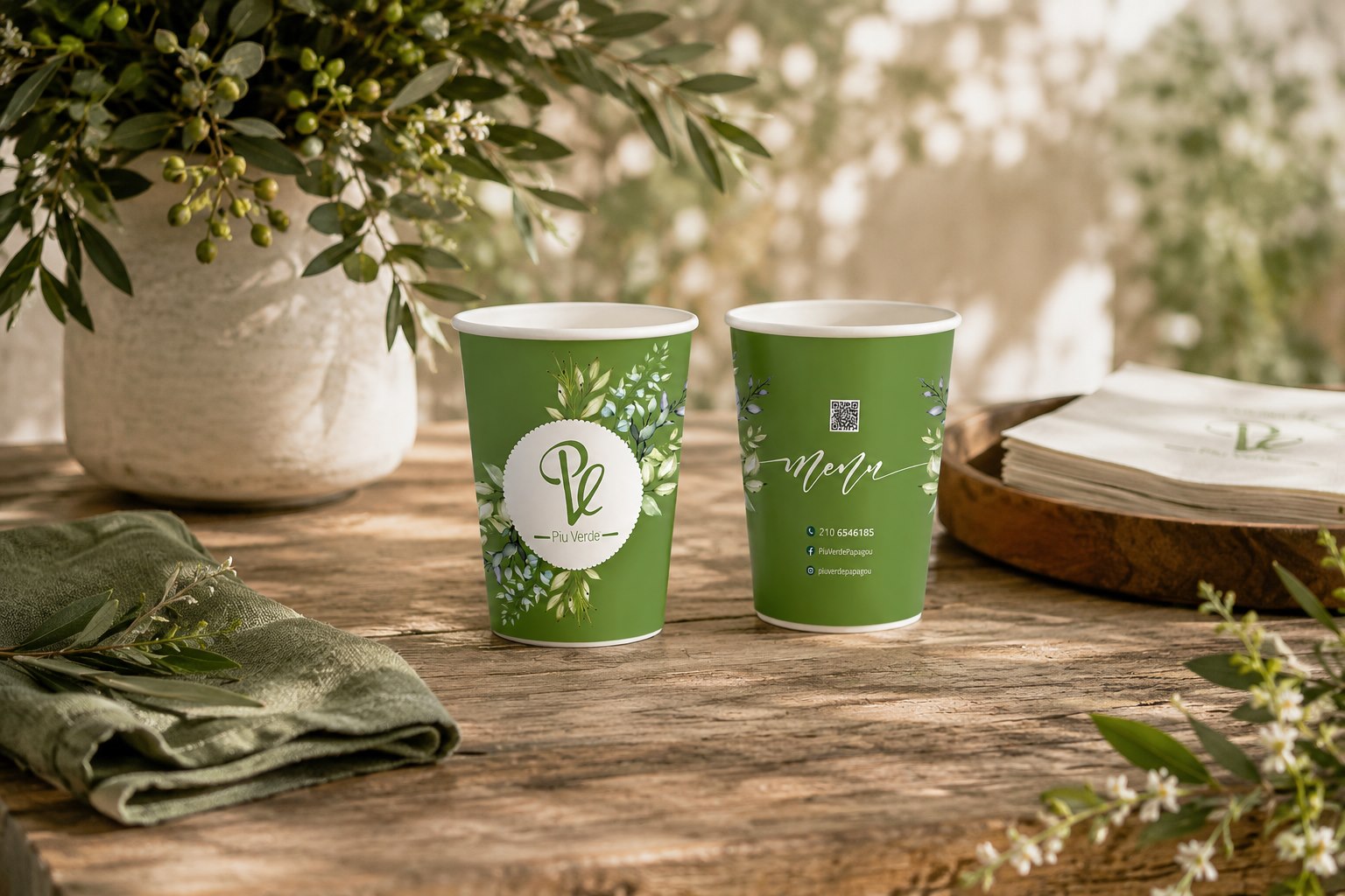
Piu Verde was not a single printed piece. It became an ongoing hospitality system: restaurant menus, cafe menus, brunch, cocktails, sous-plat, cups, stickers, QR details and garden labels, updated across seasons without losing the calm botanical language of the place.
The setting mattered. Piu Verde sits inside greenery, so the work had to feel connected to the table and the garden, not like decoration placed on top of a menu. Typography, botanical illustration, spacing and production details had to keep the material readable while still carrying the atmosphere of the venue.
The most important part was continuity. The system had to absorb new prices, new categories, bilingual content, different formats and small physical applications. Guests meet the brand while reading, ordering, waiting, drinking coffee, scanning a QR code or noticing a plant label in the garden. That is where the design had to hold.
Skills: Menu Design · Print Design · Typography · Production Artwork · Hospitality Touchpoint System · Garden Label Design · Physical Brand Applications · Seasonal Content Updates
System
The work lived in repetition. A restaurant menu can look resolved once. A real hospitality system has to keep working after the first version: when the cafe menu changes, when cocktails are updated, when a placemat needs a QR detail, when the garden needs labels, when a small cup still has to feel like the same place.
For Piu Verde, the botanical direction gave the material a recognizable world. The structure kept it usable.
Menu Logic
Menus are dense objects. They need hierarchy before they need charm. Categories, prices, bilingual information and repeated updates have to be easy to scan, especially in an all-day venue where breakfast, lunch, dinner and drinks belong to different moments.
The design language stays gentle, but the structure is practical: clear sections, restrained decorative use, enough air for reading and a consistent tone across different menu families.
Physical Touchpoints
The strongest part of this project is that it does not stop at the printed menu. It reaches the surfaces and small gestures of the restaurant: placemats, cups, labels, QR details, seasonal updates and the quiet material things a guest notices without being told to notice them.
That is where hospitality design becomes specific. Not a logo repeated everywhere, but a system that knows what each object is supposed to do.
Piu Verde shows the value of staying with a brand after the first design decision. The work is in the updates, the formats, the corrections, the print files and the restraint needed to keep every new piece inside the same visual world. Quiet work, but not small work.