

Pere Ubu
Website direction, image curation and content architecture for an all-day restaurant bar in Glyfada.

Overview
Pere Ubu is not one simple restaurant page. It is an all-day venue with several different moods: breakfast, lunch, dinner, cocktails, music, private events and a loyal urban audience in Glyfada. The website had to make those parts feel connected without flattening the personality of the place.
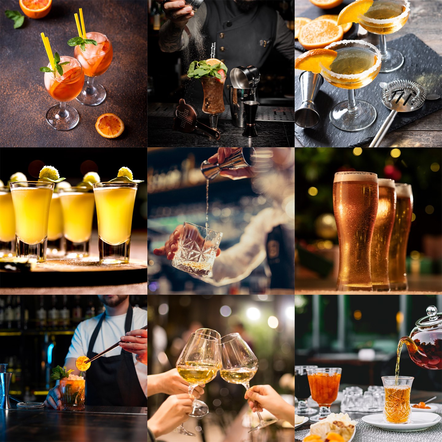
A large part of the work was selection. The archive had volume, but volume is not direction. Hundreds of photographs had to be reviewed, compared and cut down until each page had a clear visual role: atmosphere for entry, appetite for food, tactility for drinks, energy for music, intimacy for private events.
The result is a hospitality website built around routes, not decoration. A visitor can move quickly toward menus, food, drinks, music or private events, while the brand still feels like Pere Ubu: dark, social, warm, slightly theatrical and very much tied to the physical space.
Skills: Hospitality Web Design · WordPress Website Design · Art Direction · Image Research & Curation · Content Architecture · Visual Storytelling · Menu Structure · Hospitality UX · Ongoing Support
Site Logic
The site was structured around the way people actually decide. Some visitors want the menu. Some want the mood. Some need to understand whether the venue can hold a private dinner, a party or a corporate moment. Each route needed its own visual temperature.
The homepage works as the first impression: dark interior, logo, movement, a clear entry into the main experiences. From there, the website separates the brand into distinct but related worlds: gastronomy, menus, desserts, wine, mixology, music and private events.
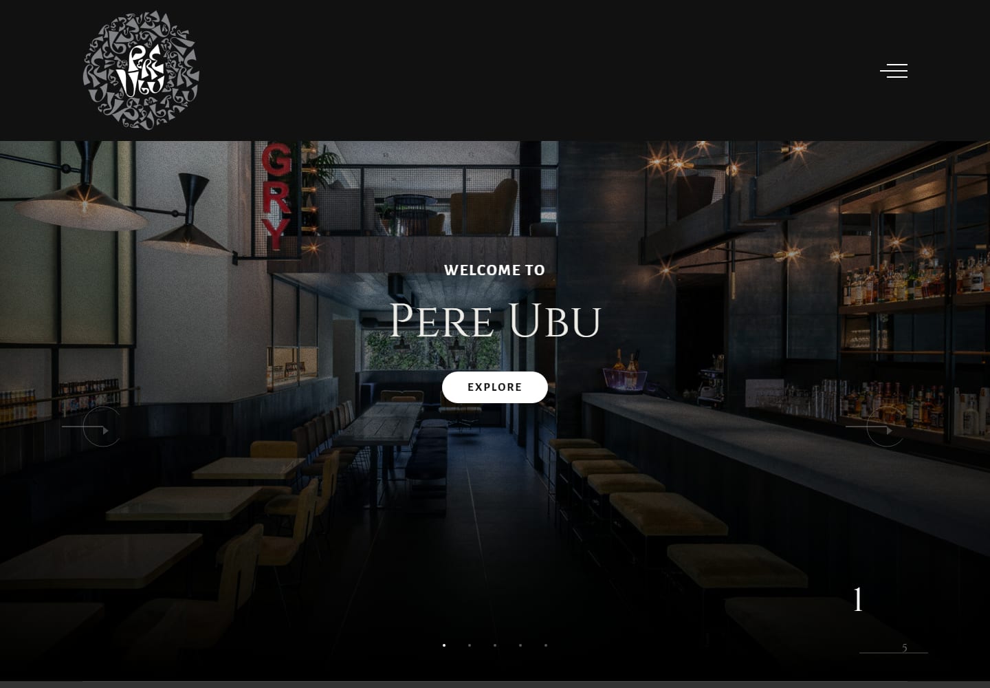
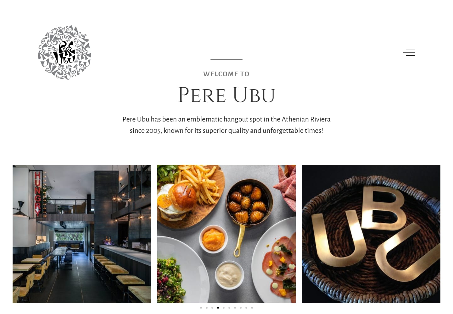
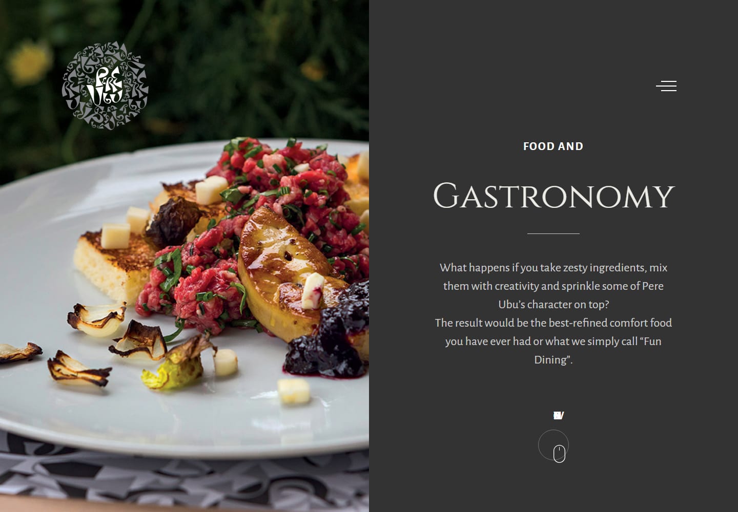
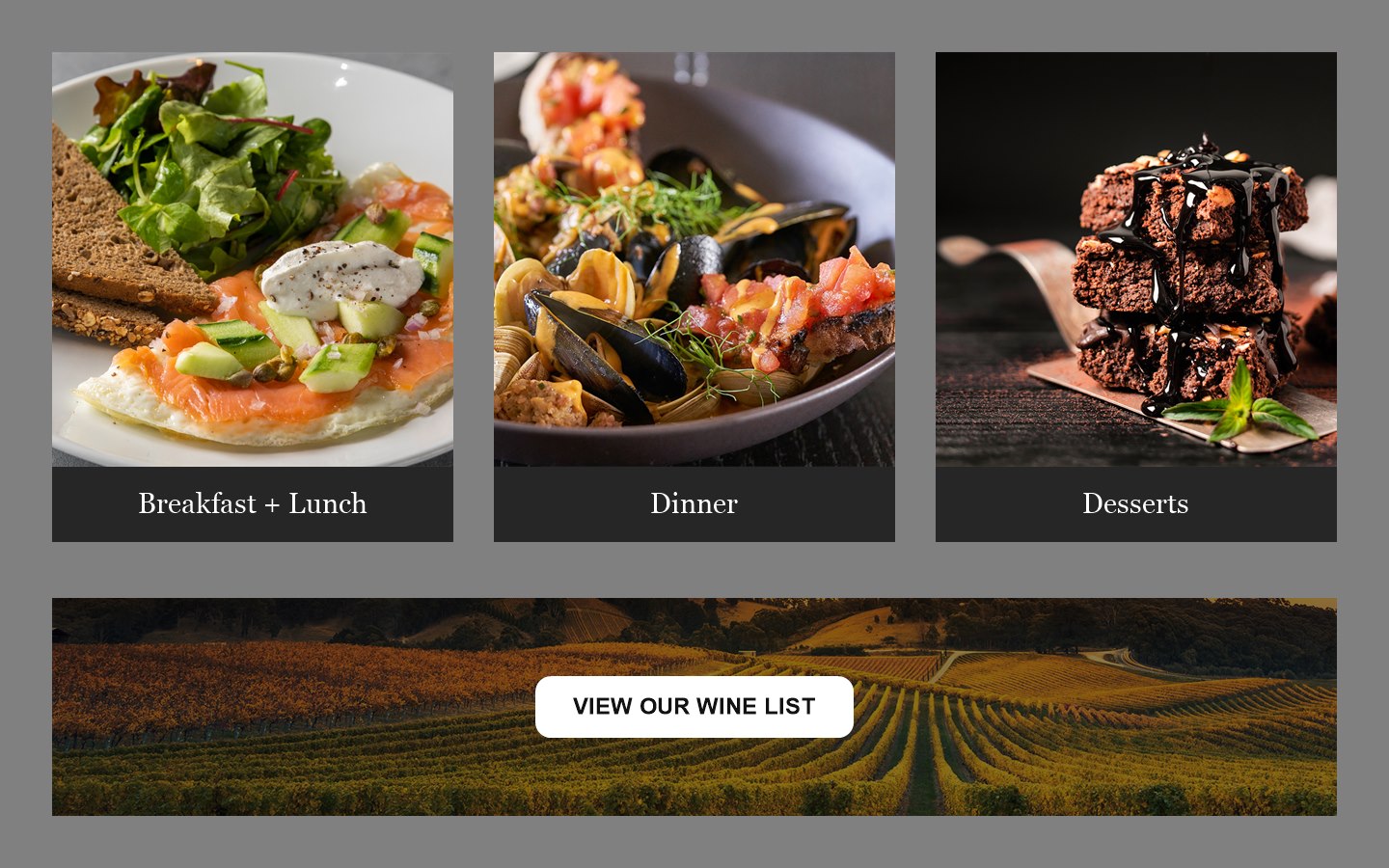
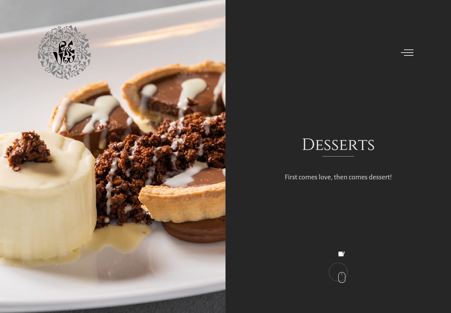
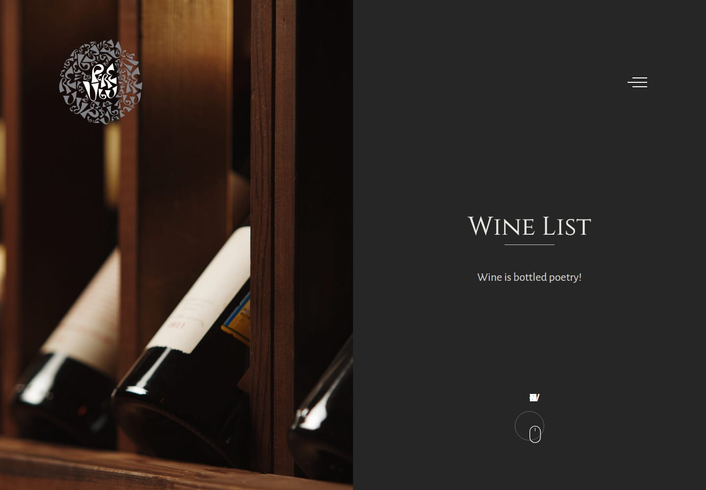
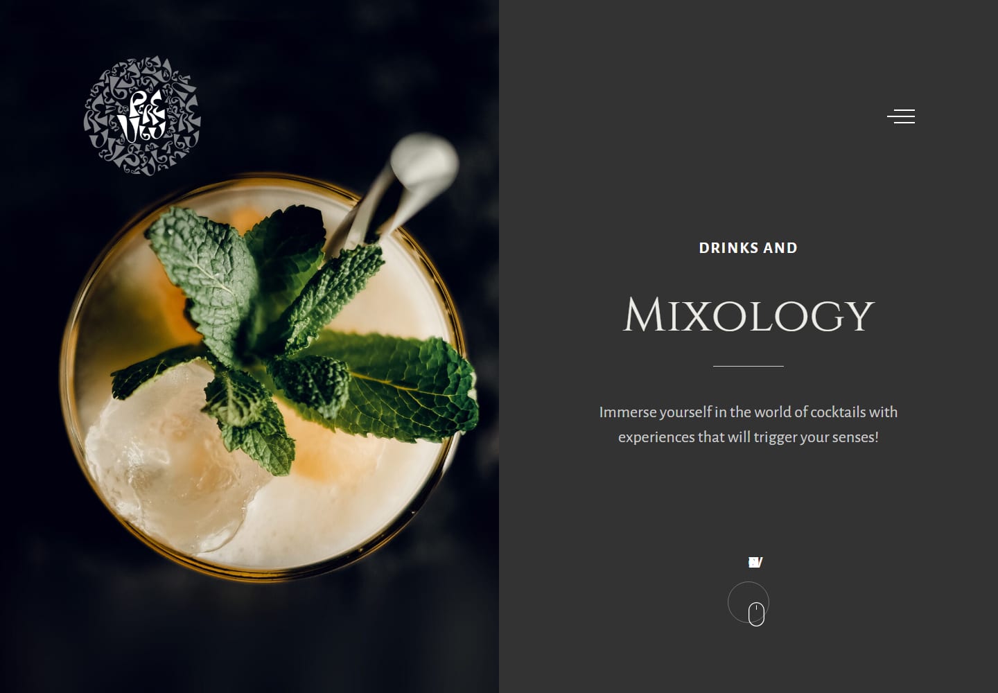
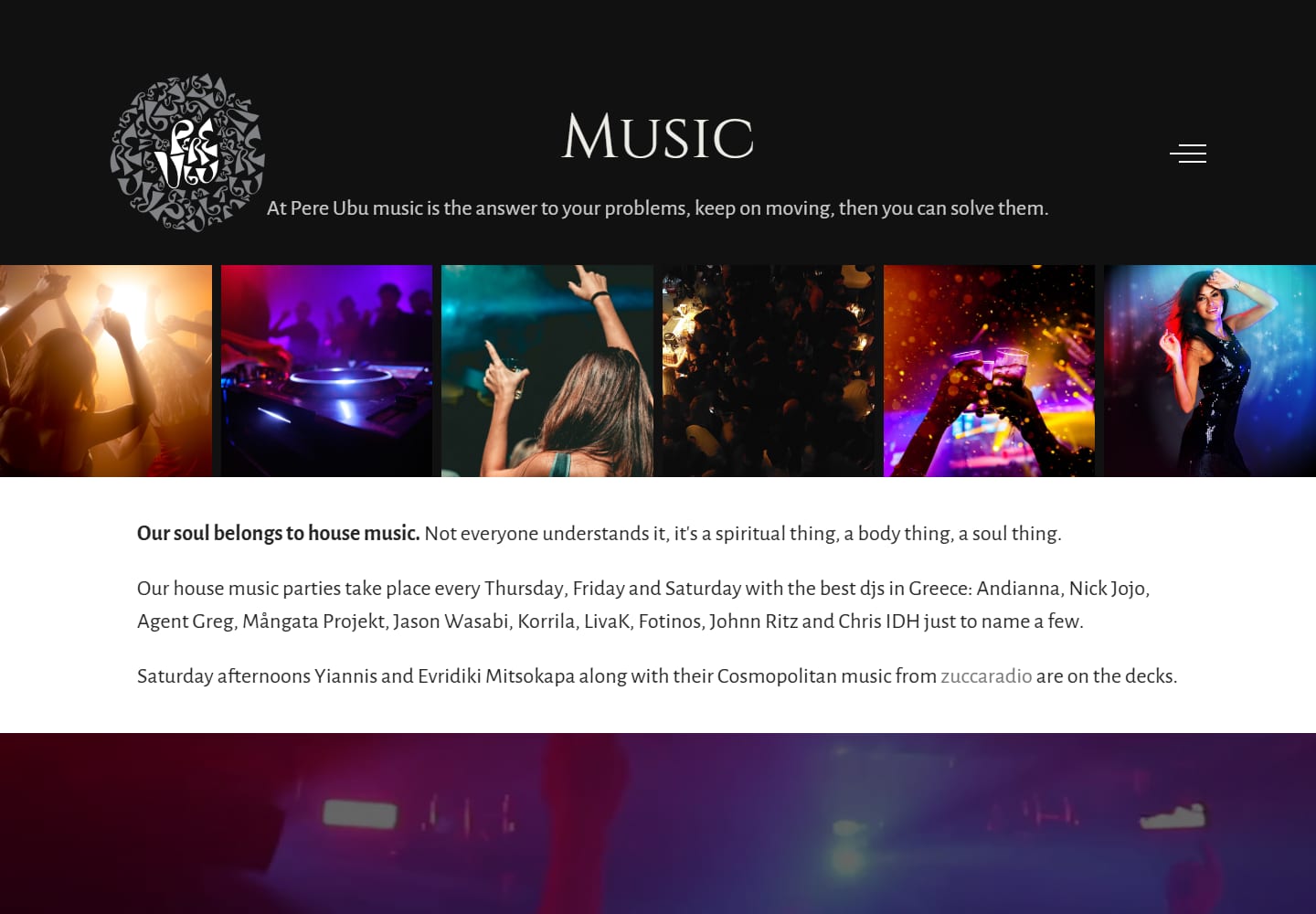
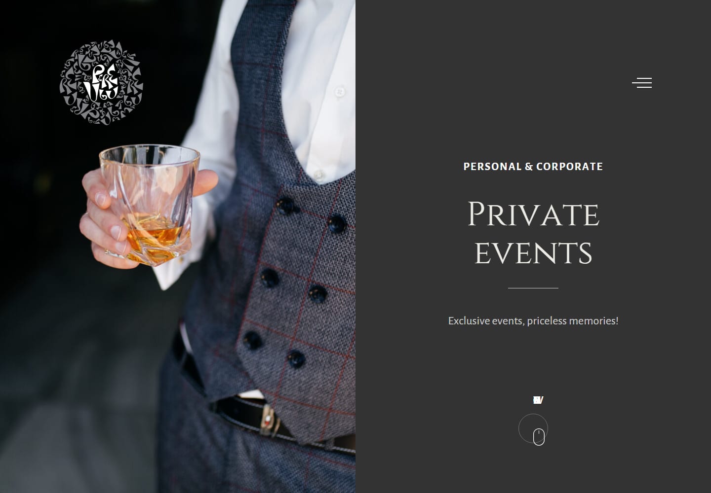
Image Curation
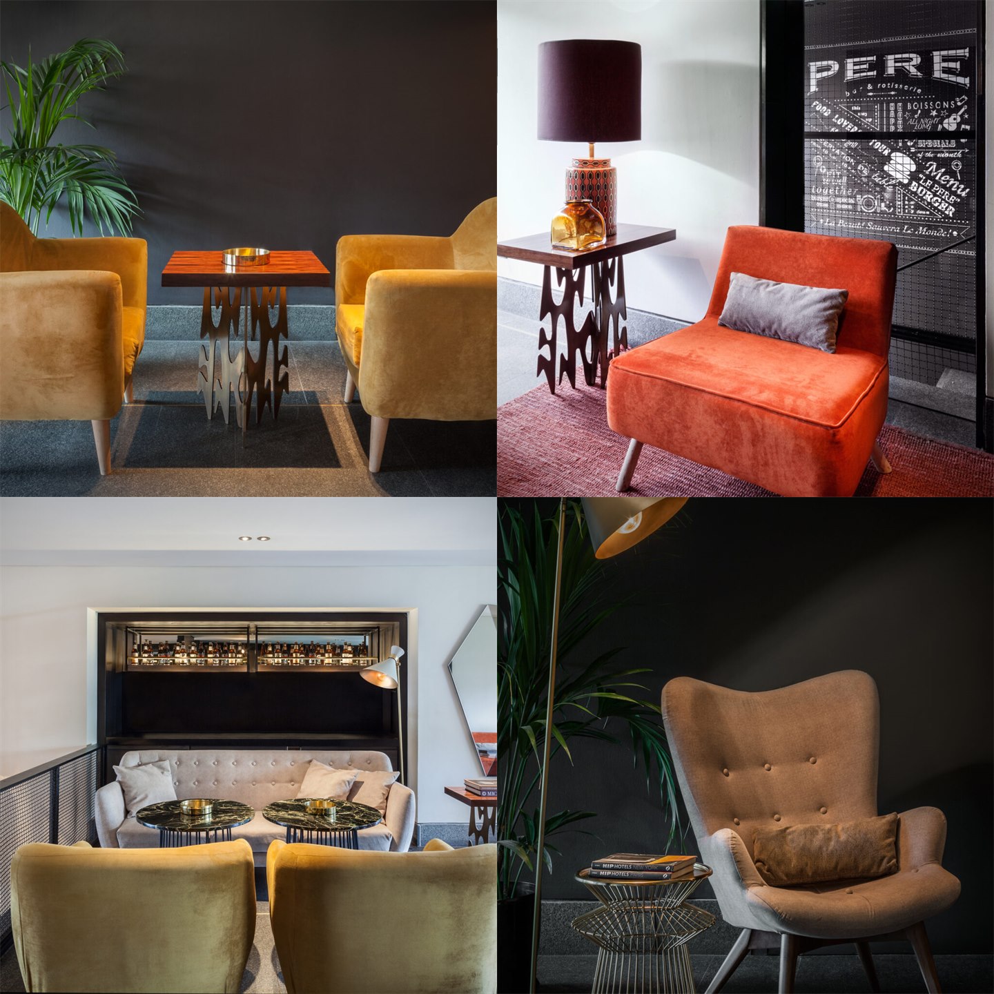
The image work was not about finding the prettiest photograph. It was about deciding what each page had to make the visitor feel and understand. Some images could be beautiful but useless. Others had the right information: a seat, a bar, a plate, a texture, a crowd, a reason to book.
This is where hospitality web design becomes editing. The archive had to be turned into a usable visual language, with enough variety to support the site and enough restraint to keep the brand recognizable.
Menu Structure
Menus are often treated as a download link. Here they had to become part of the experience. Morning, dinner, desserts and wine each needed a page rhythm before the PDF: photography first, orientation second, download after the appetite was already there.
That decision matters. A menu page can be purely functional, or it can continue the brand. Pere Ubu needed the second version.
The work was not only layout. It was judgment. Pere Ubu needed a website that could absorb a large visual archive, separate different hospitality occasions and still feel like one place. The design work was in the structure, but also in the cuts: which image stays, which image goes, and what each page is allowed to say before the visitor clicks.