

Macelleria
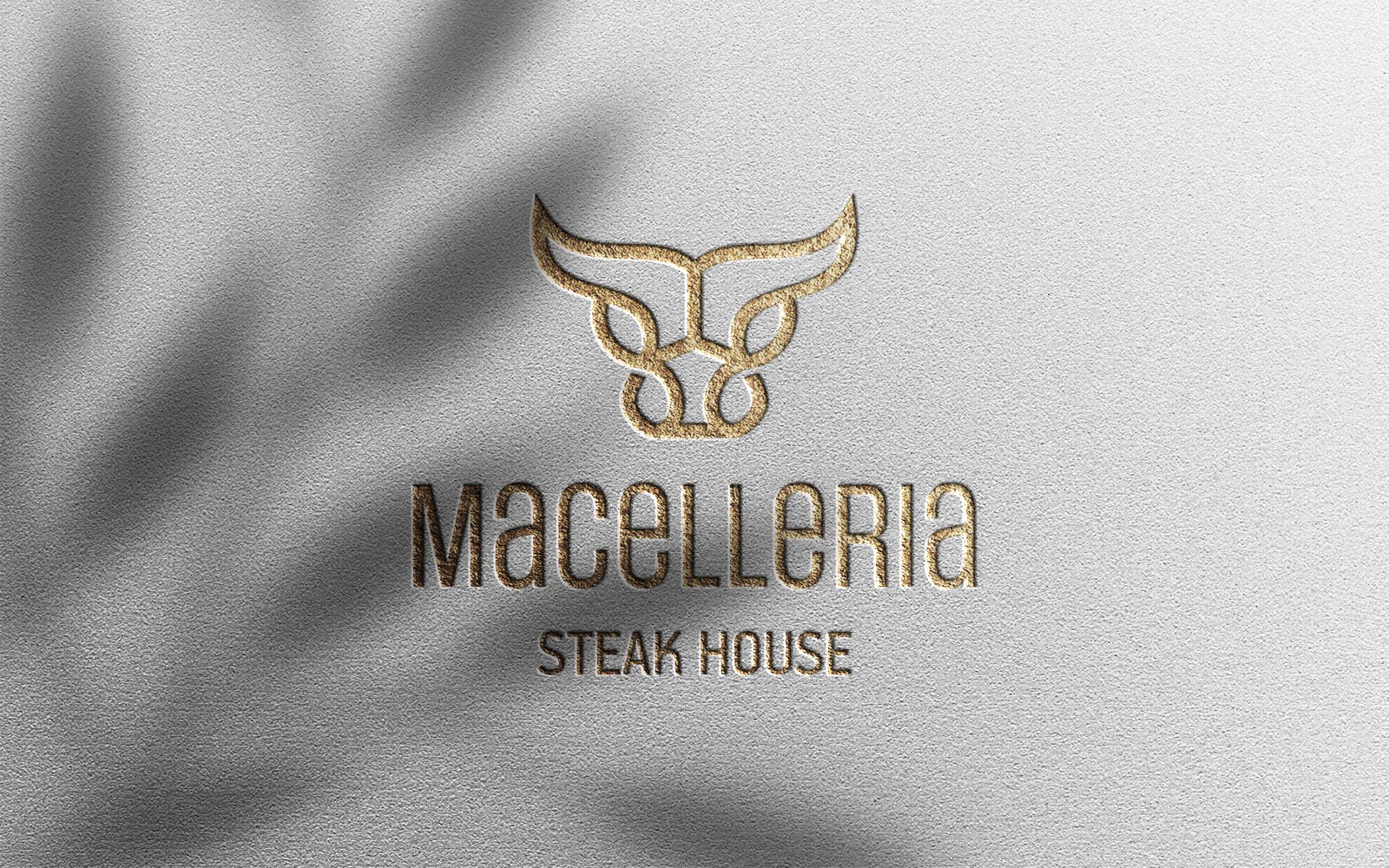
Identity, menus and packaging for a steak house, built on a bull drawn in one continuous line.

Overview
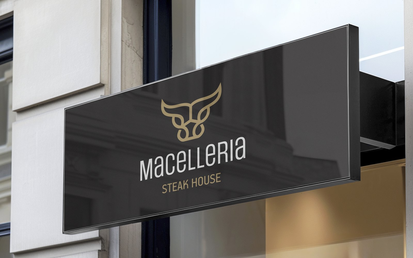
I drew the logotype and designed everything the restaurant printed: five menus, the placemats, the napkins, the bags and boxes for takeaway, the bill folder, the apron, and the artwork for the signs on the facade and inside.
The bull had to hold on a sign more than a metre wide and on a paper bag a few centimetres across, so it carries no detail that could fall apart.
I built their WordPress site as well.
Skills: Logotype Design · Brand Identity · Menu Design · Packaging Design · Print Production · Signage Artwork · WordPress
One line
Two horns, two eyes and a snout, drawn without lifting the pen. The palette stops at two: gold, Pantone Gold 10348 C, and black.
Five menus
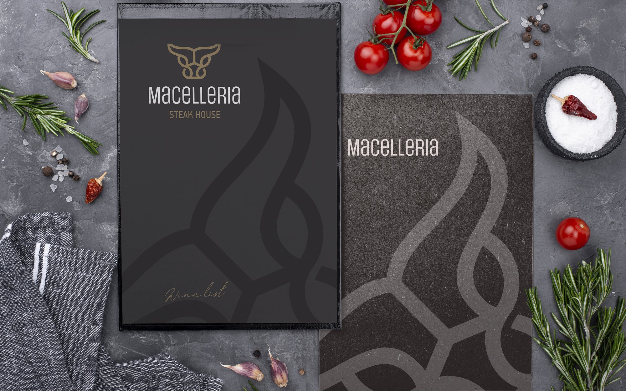
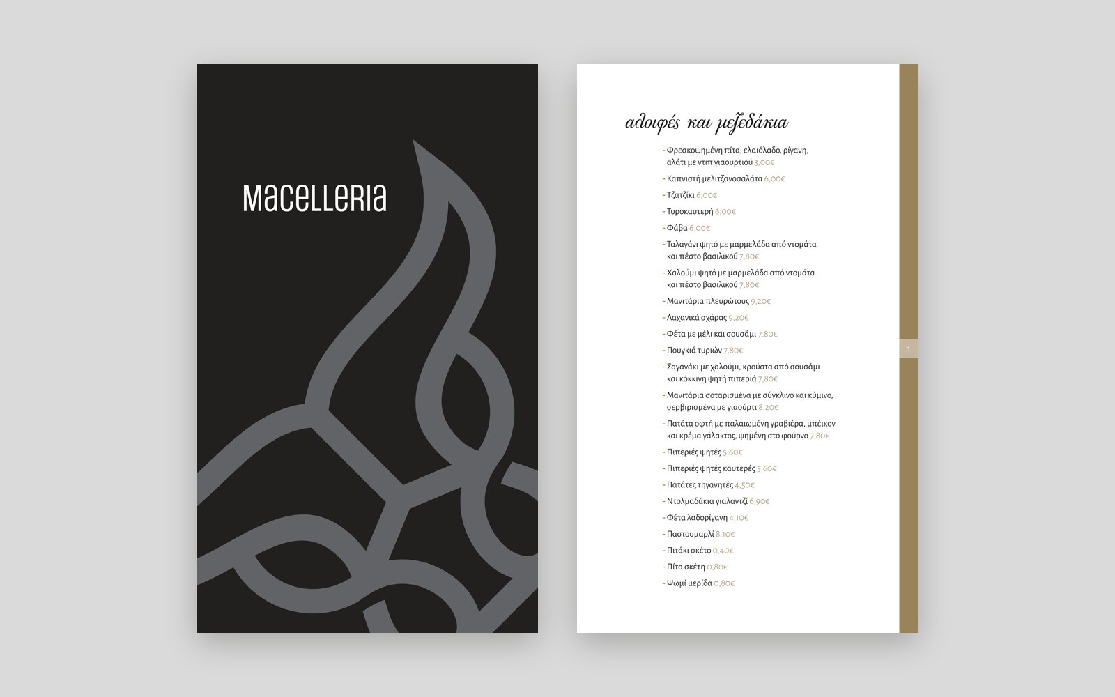
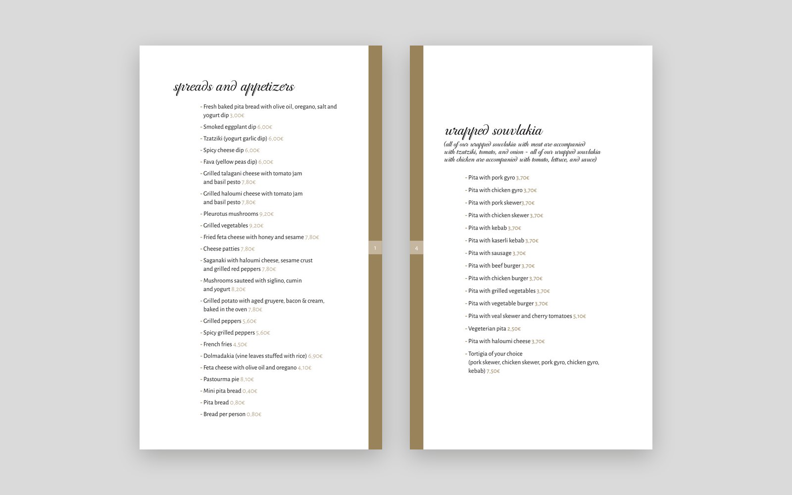
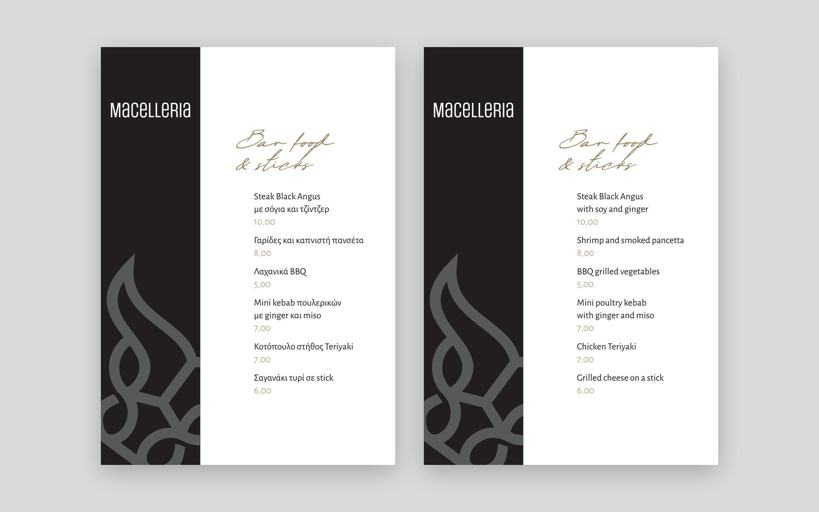
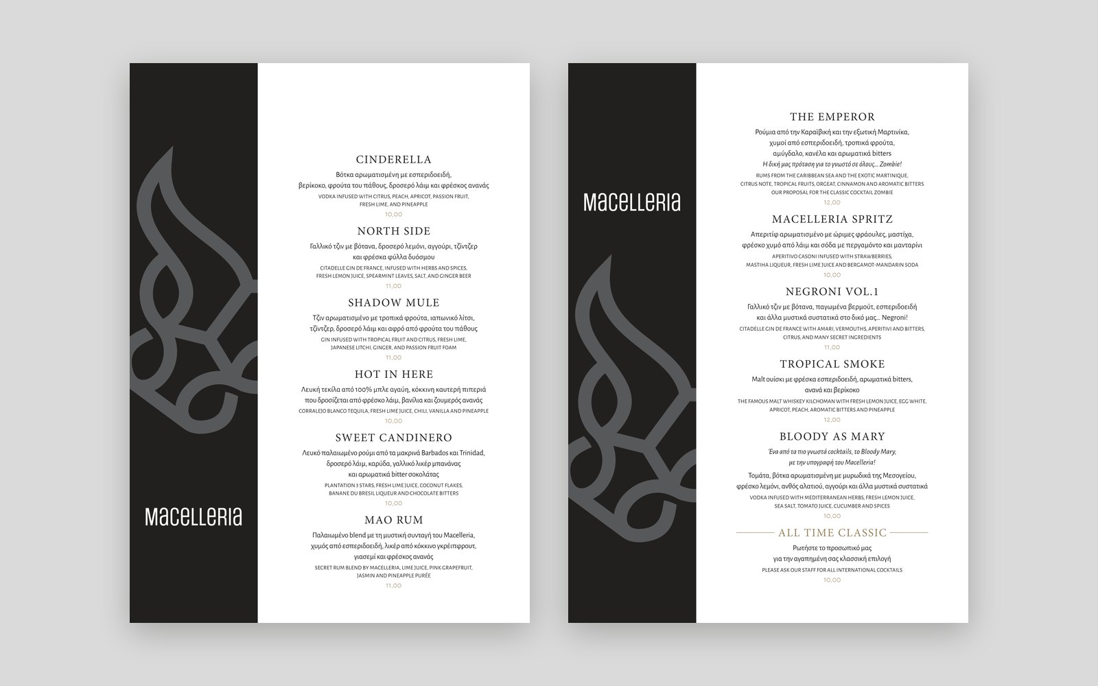
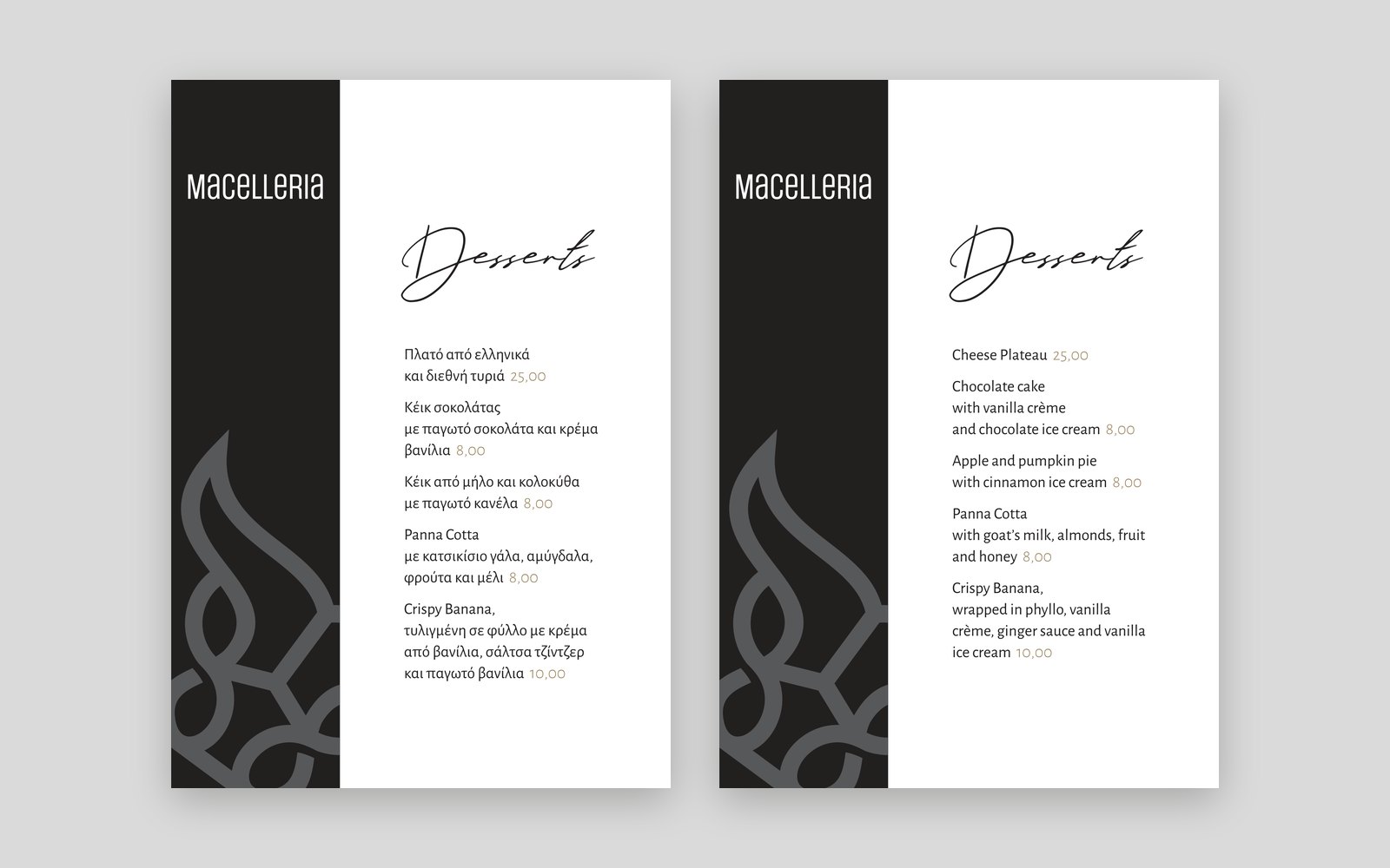
Dine-in in Greek and English, bar food, cocktails, desserts and a wine list. Every cover is black or dark grey, with the bull enlarged until only part of it fits.
Inside, a gold band runs down the outer edge and the food stays black on white. A steak house is a dark room, so the page has to be the brightest thing on the table.
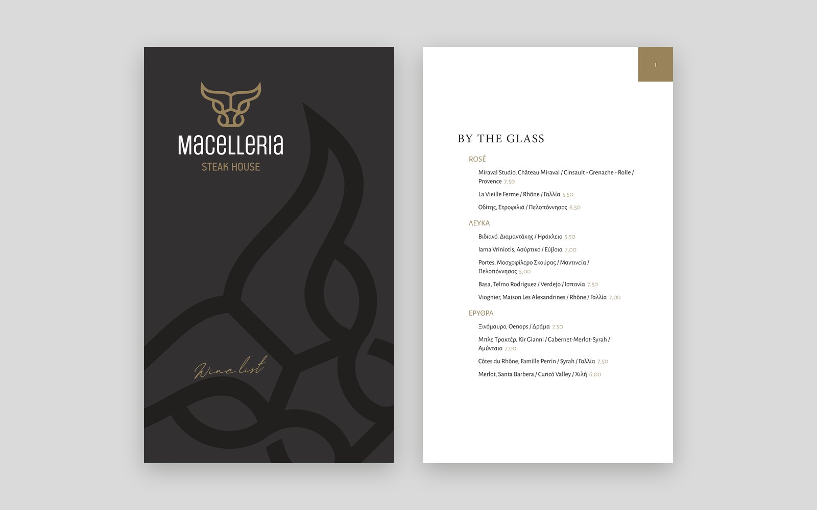
In the room and out the door
Takeaway had to arrive looking like the restaurant, and the room had to match it: bags in three sizes, small bags in two, four boxes, the folder the bill came in, the placemats, and the staff apron.
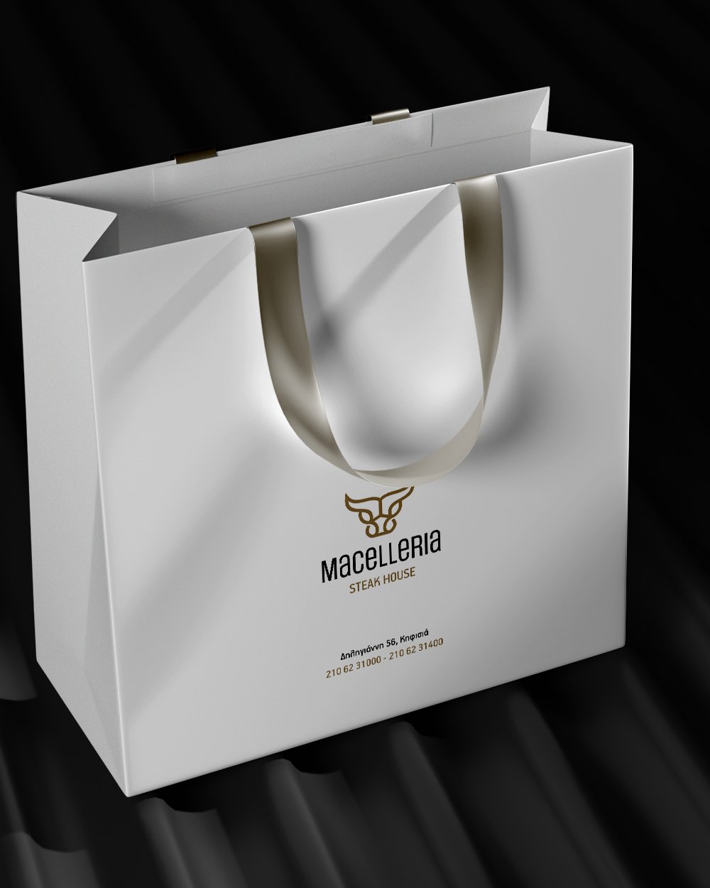
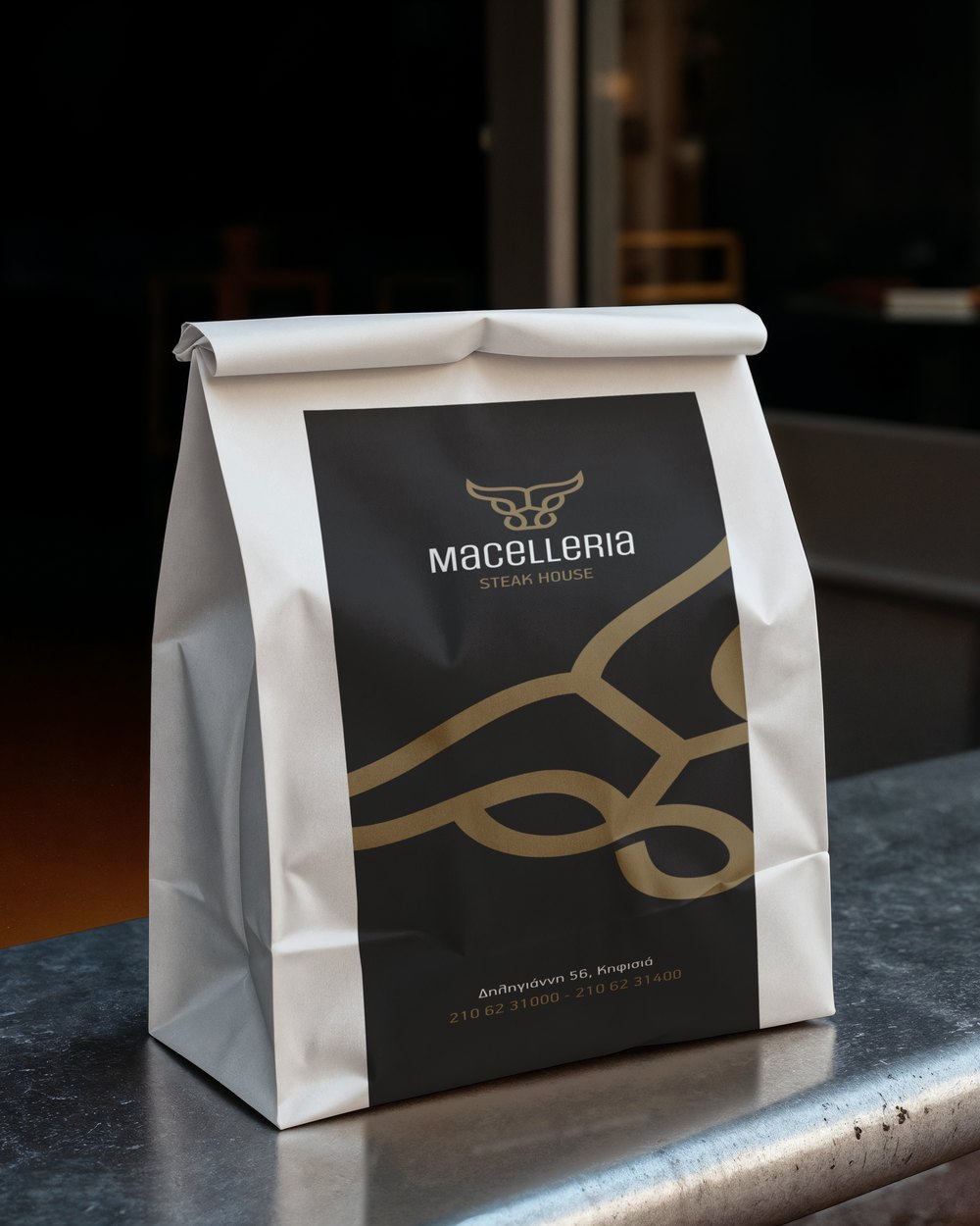
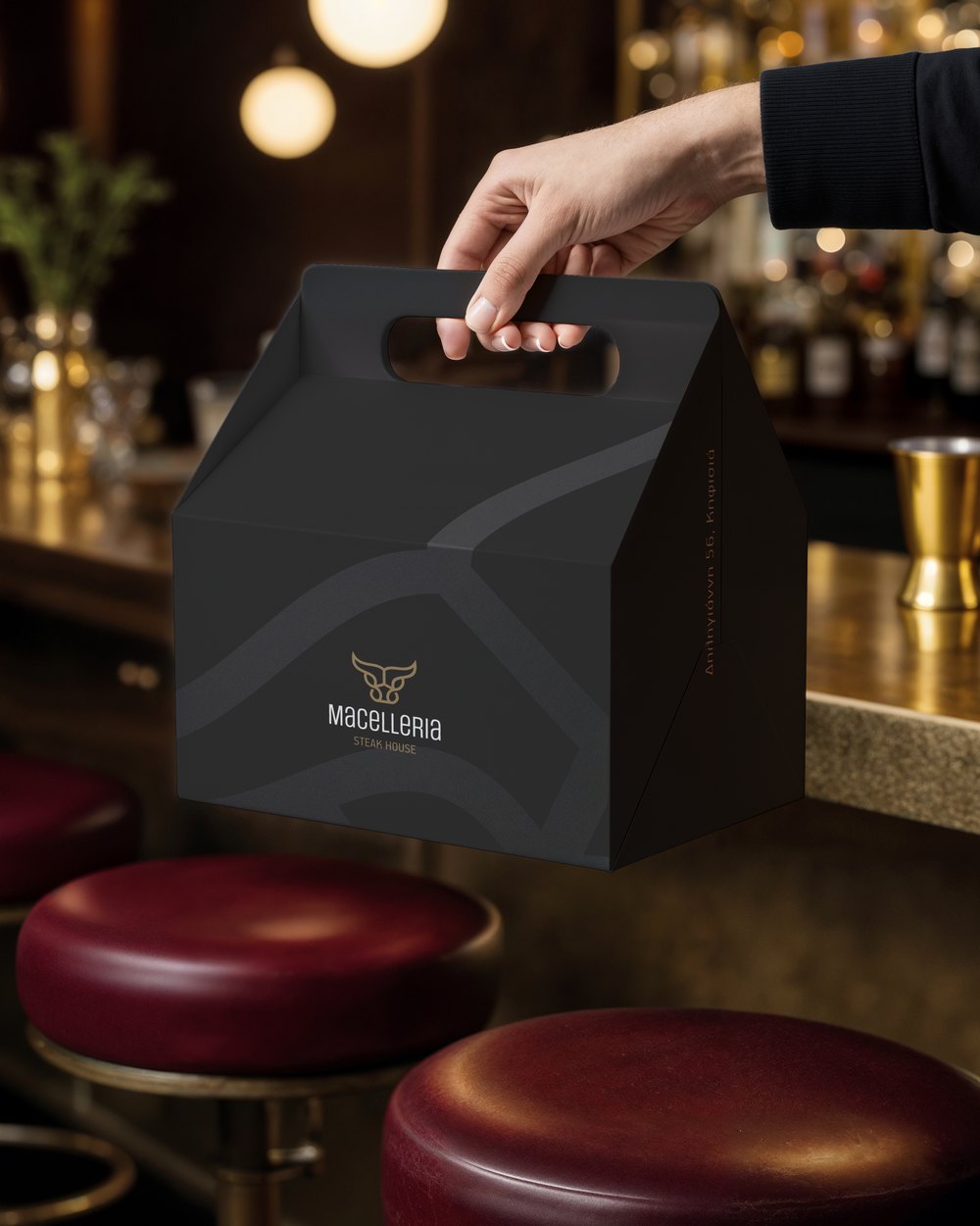
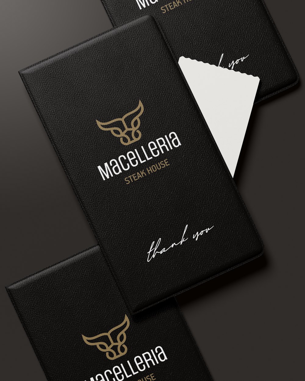
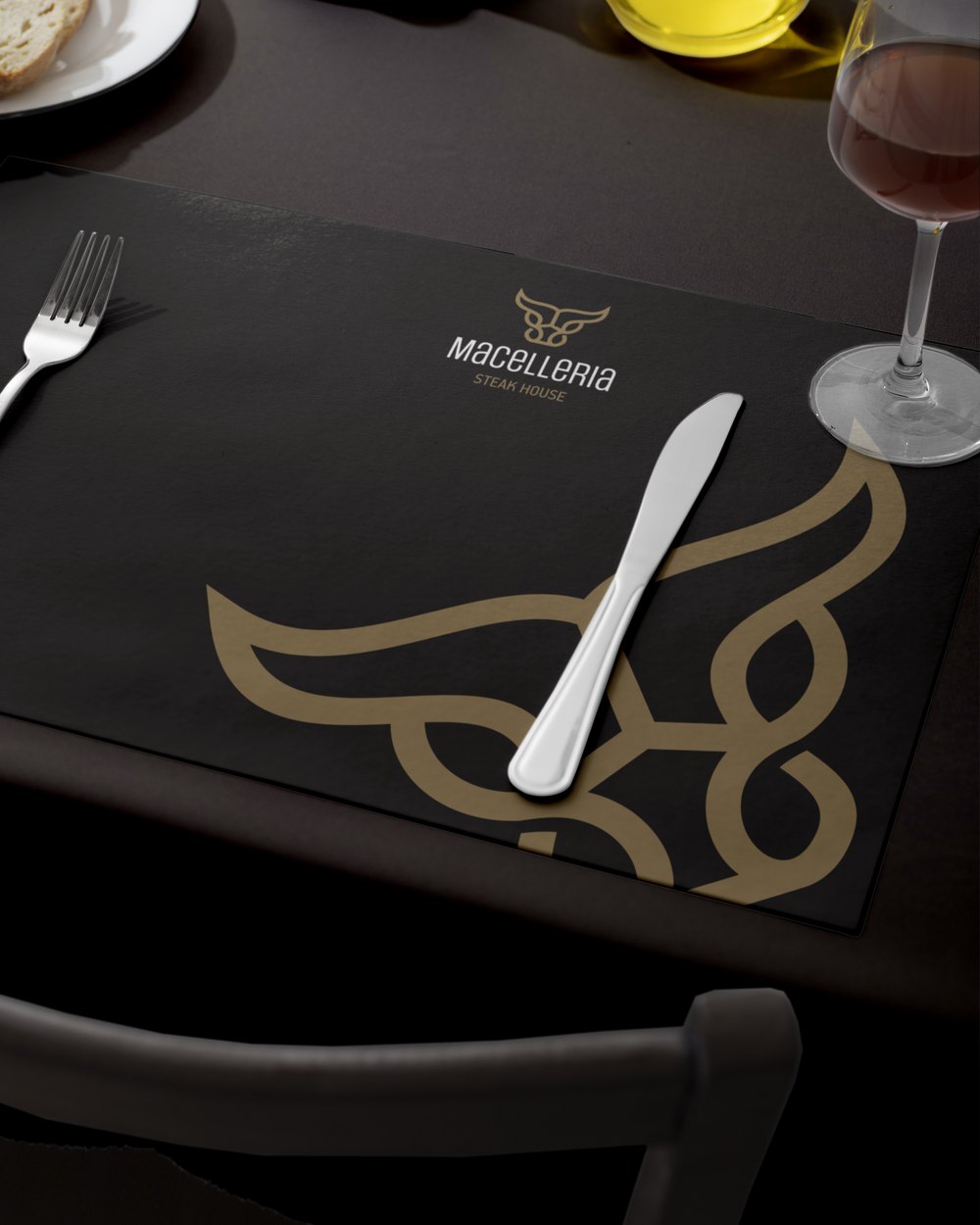
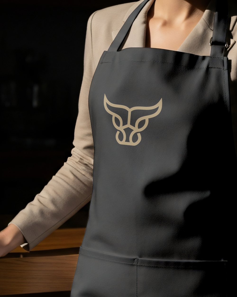
One line, every size. The same drawing goes on a sign more than a metre wide and on a paper bag a few centimetres across, because there is no detail in it to lose.